
Reby
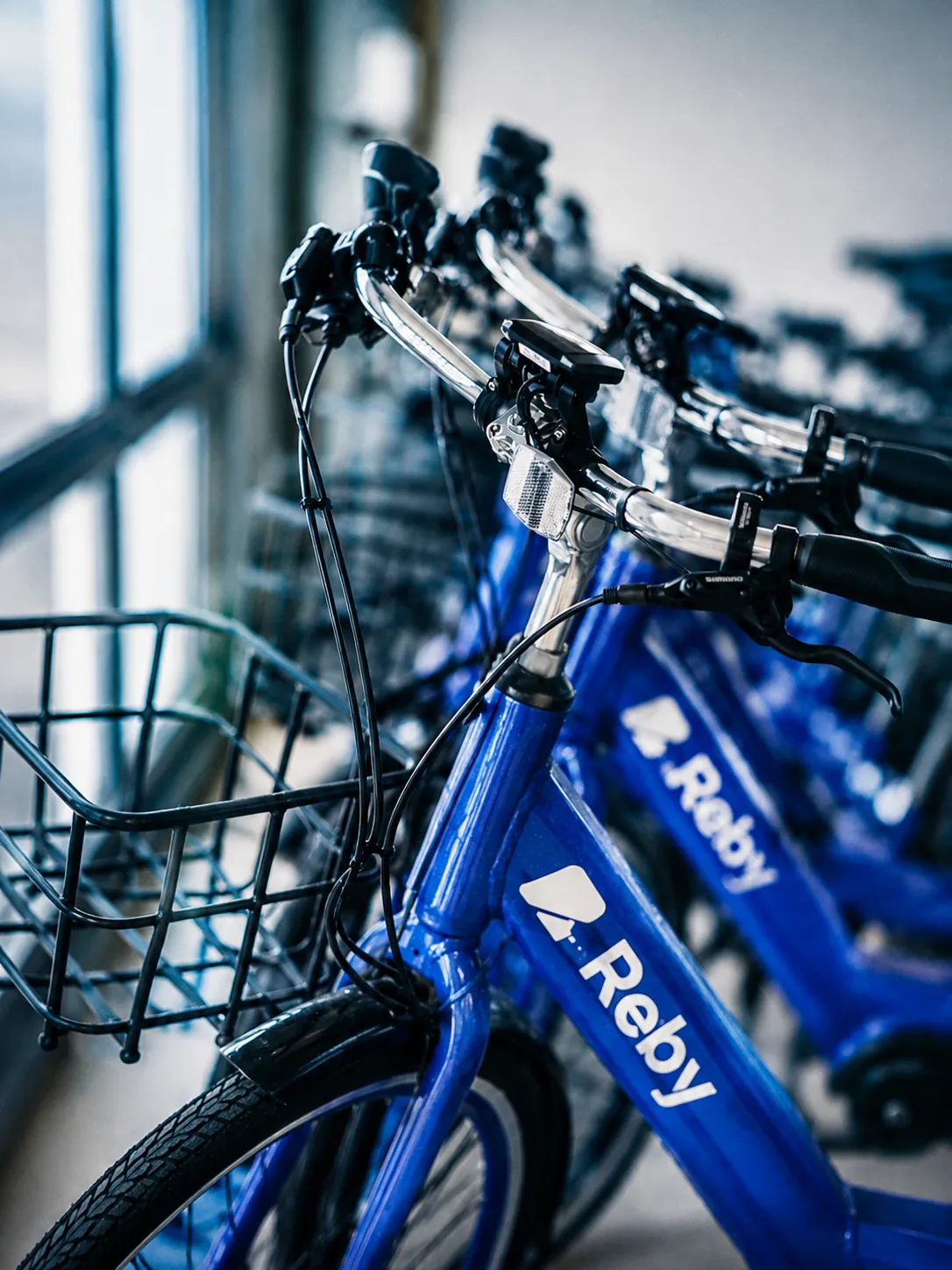
I redesigned the scan-and-unlock screen for Reby — a scooter app with 800k+ riders and over a million trips across southern Europe. It was the one screen where riders gave up.
The challenge
By 2022 Reby ran shared electric scooters in around twenty cities across Spain and Italy, with 800,000+ riders and over a million trips. Every one of those trips began the same way: point your phone at the scooter, scan its QR code, and ride.
That single screen was the app’s weakest. The scan target fought with the map behind it, a wrong or unreadable code dead-ended with no way forward, and help sat three taps deep in a menu. Miss the scan and you’re stranded on the pavement next to a scooter you’ve already paid to unlock.
Numbers
How I worked
01The screen that existed
This is the unlock screen as it shipped. The scan area competed with the map behind it, the live state was ambiguous, and a failed scan led nowhere. It read fine in a screenshot and broke on the street — exactly where it had to work.
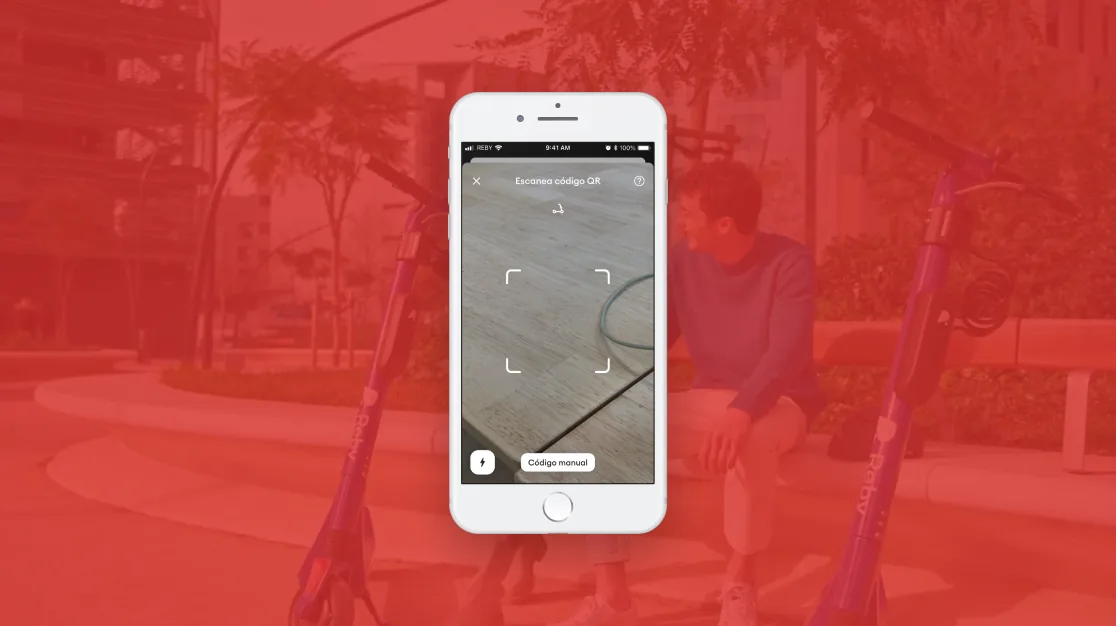
02Redesigned the scan itself
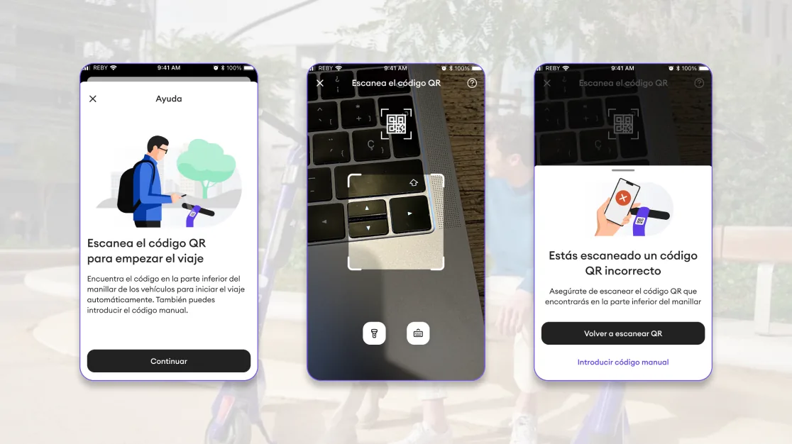
I rebuilt the camera view around a single job: scanning. The QR target became the clear focus, the scooter stayed visible behind it for context, and the state — searching, found, wrong code — was unmistakable at a glance, gloves or no gloves.
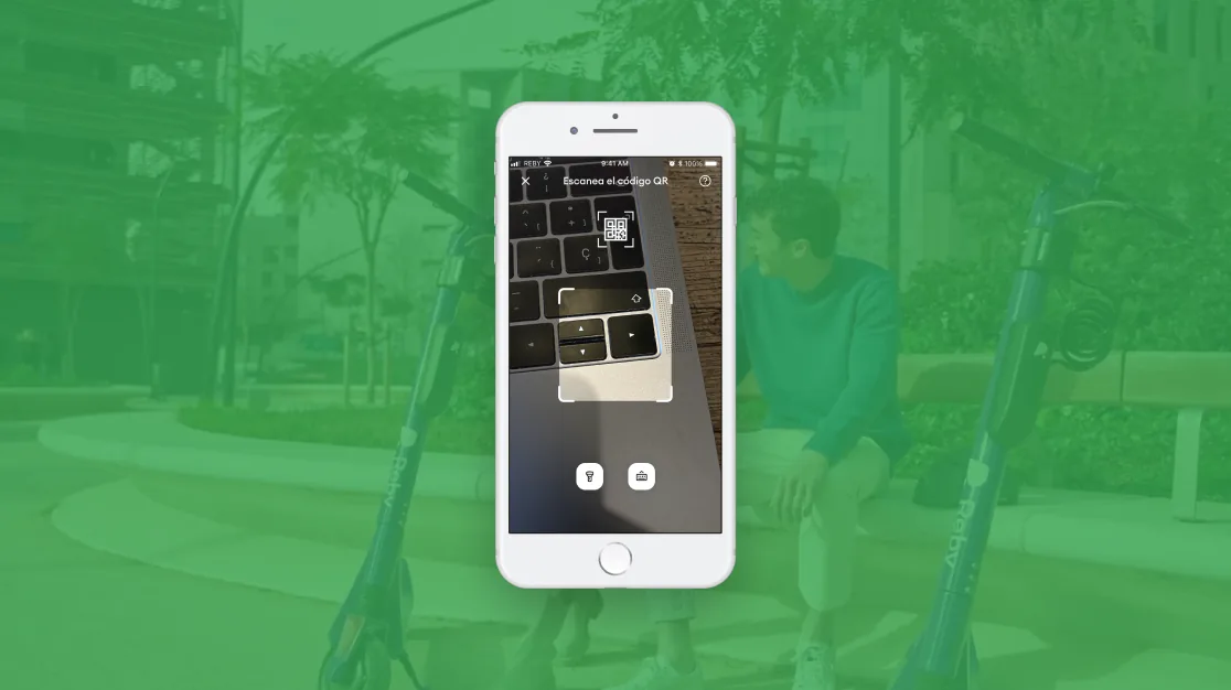
03Turned errors into a way forward
A wrong or unreadable code used to be a wall. Now the screen says what went wrong and hands you the next move on the spot — rescan or get help — so a bad scan is a detour, not a dead end.
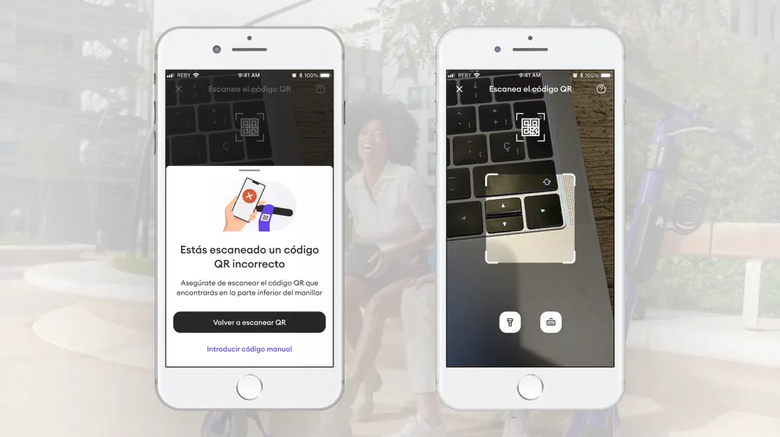
04Put help at the moment of need
Help moved out of a buried menu and into the flow: a short, scannable guide on how to scan and what to do when it won’t, surfaced exactly when a rider is stuck instead of hidden where no one looks.
05Measured what changed
I wasn’t after a prettier screen — I was after a working one. I instrumented the scan funnel and ran the redesign against the old flow: first-try success, drop-off, time-to-ride and support tickets tagged “can’t unlock”. The lift held across devices and lighting.
What changed
- First-try scan success climbed and drop-off at the scan step nearly halved.
- A failed scan now recovers in place — rescan or help — instead of stranding the rider.
- Support contacts about not being able to unlock dropped sharply.
- The most-used, highest-stakes screen for 800k+ riders became its most reliable.
One lesson
A screen can look finished and still fail the second someone’s on the street with a scooter they can’t unlock. I designed for that second.