Talk
A timed design challenge for Talk, a messaging app with a social events layer. The brief was narrow: people browse events but don’t join. Make them want to.
The challenge
Talk is a messaging-first app with a social twist: you explore and connect with people nearby, and a feed surfaces events around your city — including which of your contacts are going.
It reached me as a design challenge: a proof of concept with one clear problem. The Events section exists and works, but participation is low. Redesign it to get more people joining — and build it properly, with autolayout, components, type and color styles, light and dark. A timed exercise followed by a session to defend every decision.
How I worked
01Read the product, not just the brief
Talk is a chat app first; events are a secondary, social layer. So the fix had to feel native to messaging — discovering an event should feel like seeing what your friends are up to, not browsing a listings site.
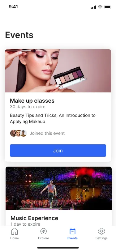
02Reframed the problem as belonging, not browsing
Low participation wasn’t a layout bug. People join things their friends join. I shifted the goal from "show more events" to "make the user feel part of a community" — every decision after that served social proof.
03Personalised the feed
Used preferences, past attendance and location to suggest events that actually fit, with category filters (Sport, Travel, Art, Sushi, Poetry…). Sections like Popular this week, Personal picks, Local highlights and Your favorites gave the feed a point of view instead of one flat list.
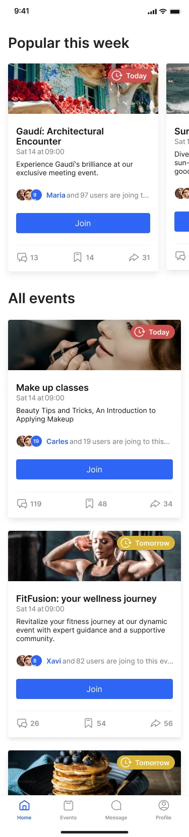
04Made every event social
Added comment, save and share actions to each card, plus a visible avatar stack of who’s already going. Joining stopped being a silent transaction and became something your contacts can see and follow.
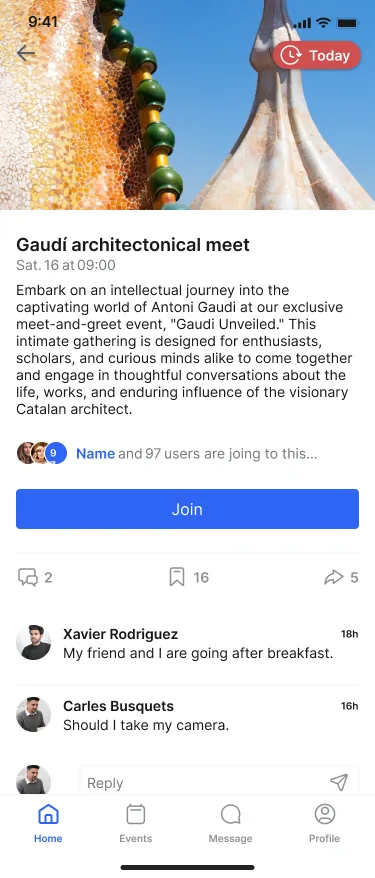
05Built distribution in
Native sharing so one person can pull friends in, and lock-screen notifications when someone you know joins an event. Participation needed a way to travel beyond the app, not just sit inside it.
06Built the system before the screens
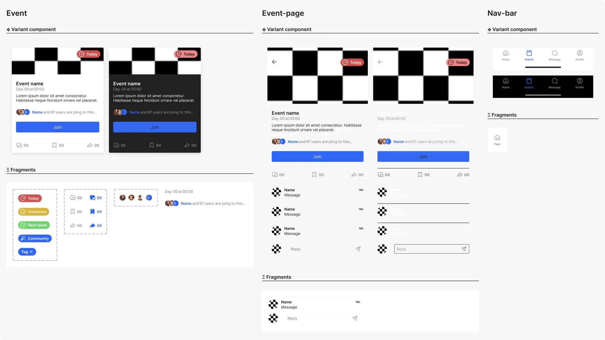
The brief asked for technical rigour, so I treated it as the foundation: a type scale (SF Compact Display), light and dark color tokens, an icon set with selected states, and components — event card, event page, nav bar — with variants and fragments, all on autolayout.

What changed
- The Events section went from a flat list to a personalised, filterable feed driven by interests, attendance and location.
- Every event became social — comment, save and share, with a visible stack of contacts already going.
- Participation got distribution: native sharing and lock-screen nudges when a friend joins.
- A reusable design system underneath — type scale, light and dark tokens, icons and autolayout components — so the redesign could actually ship.
One lesson
Nobody joins an events list. They join the people already on it.