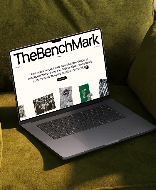
TheBenchMark
The website for TheBenchMark — Alex Ruiz’s weekly markets newsletter — built to turn a 400k-strong audience into subscribers, with an editorial brand that reads nothing like a trading guru.
The challenge
TheBenchMark is a weekly financial newsletter by Alex Ruiz — over a decade trading, founder of the TradingLab academy and a 400k-subscriber YouTube channel. Its promise is unusual for the space: “sin humo, sin ruido, sin postureo” — no hype, no noise, no posing. Analysis to understand the market, not just follow it.
The site had to live up to that. In a category drowning in get-rich-quick funnels and neon dashboards, a calm, editorial, trustworthy website is the differentiator — and it still has to do one job: turn a reader into a subscriber.
Numbers
How I worked
01Designed against the hype
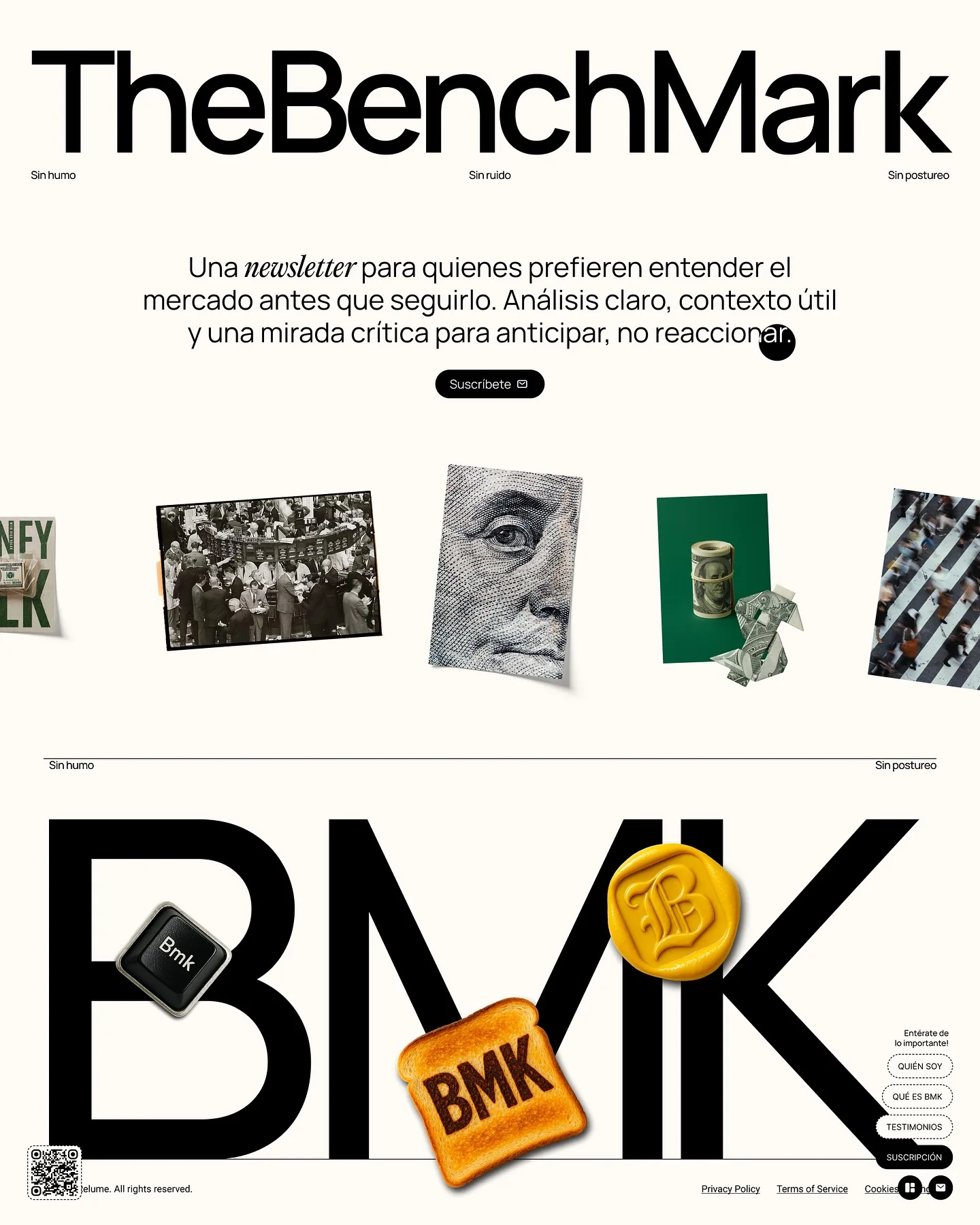
The promise is “sin humo, sin ruido, sin postureo”, so the site rejects every trading-funnel cliché — no neon charts, no countdowns, no fake urgency. Black on off-white, a giant editorial wordmark and real financial photography. It looks like a financial paper, because that’s the trust it’s borrowing.
02An editorial site, not a funnel
The hero states the promise in one line — “una newsletter para quienes prefieren entender el mercado antes que seguirlo” — over a collage of market imagery, with a single “Suscríbete” as the only thing to do. Comprehension first; conversion as the natural next step.
03A finance brand with a wink
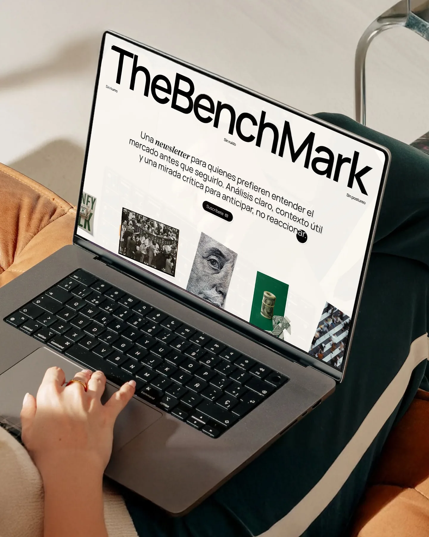
BMK gets its own playful identity — a toast stamped “BMK”, a wax seal, a keyboard key — warmth that makes a markets newsletter human and memorable without undercutting the credibility. Serious analysis, not a serious face.
04One page, one job: subscribe
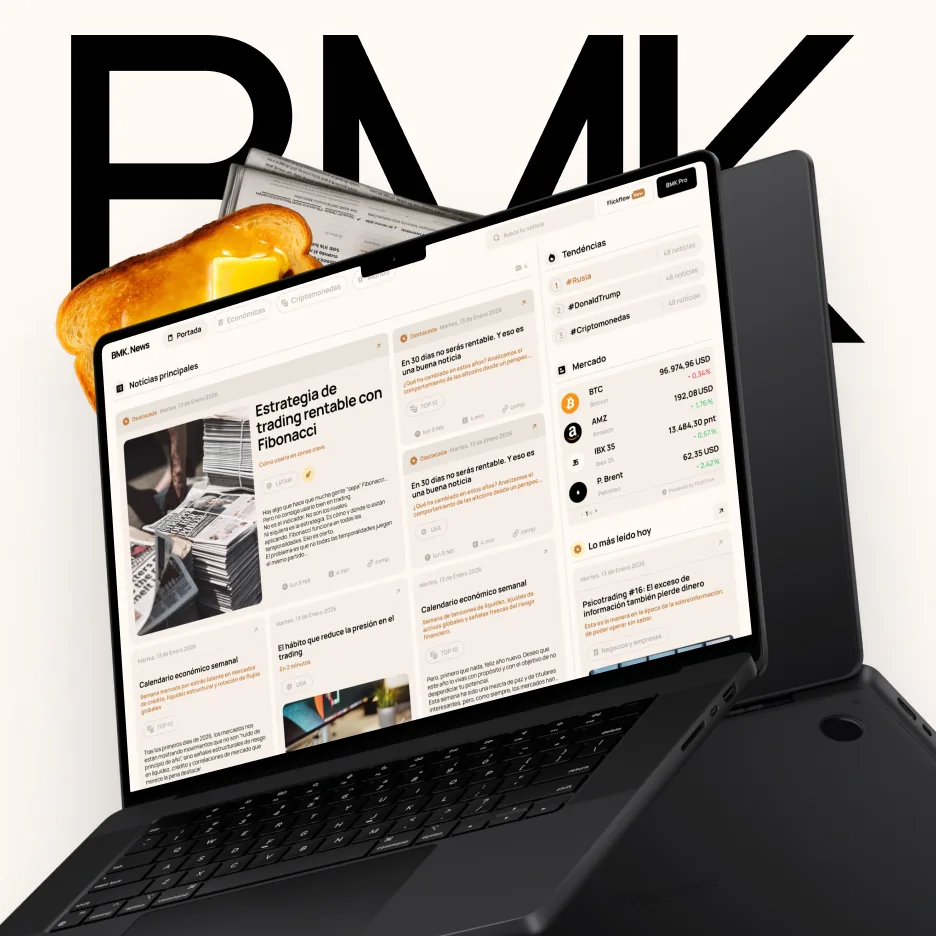
The flow is built to earn the email: quién soy (the author’s track record), qué es BMK (the promise), testimonios (proof), suscripción (the ask). Trust is stacked before the CTA, so subscribing feels like a decision, not a pitch.
What changed
- A newsletter site that reads like financial journalism, not a get-rich pitch — credibility is the design.
- A distinctive BMK identity (the toast, the wax seal) that makes a markets newsletter memorable.
- A single, clear path from “understand the promise” to “subscribe”.
- A home built to convert a 400k-strong audience into newsletter subscribers.
One lesson
In a market full of noise, the boldest move a finance brand can make is to be calm.